Your basket is currently empty!
Tag: fun
Photography A-Z
Let’s see how much camera vocabulary I can fit into the alphabet. Photography A-Z is a fun exercise and post to test knowledge, feel free to do your own and tag me! The answer is way too much so I have cut it down to the basic words and their meanings. I do reach a little with X and Y, fall flat at Q and make interesting choices all over.
What words would you have chosen in your photog alphabet? Leave me a comment below!

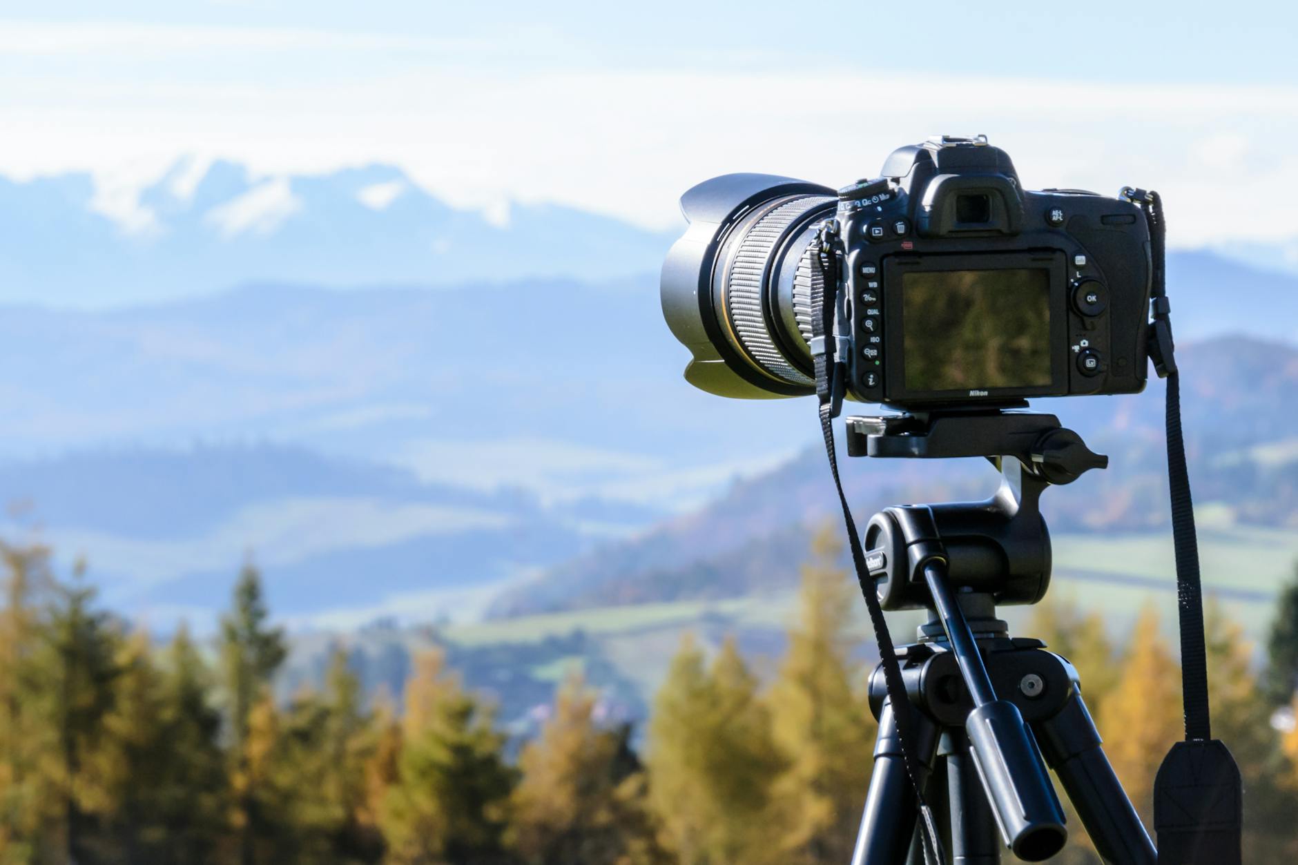
Photo by PhotoMIX Company on Pexels.com A
Aperture
The opening in the camera lens, that controls how much light enters the camera and how much of your image will be in focus.Aspect Ratio
The proportional difference between width and height. Typically 35mm film is 3:2.Av
Aperture Priority setting on a DSLR, sometimes written as AB
Bokeh
This is a technique using the aperture setting to create deliberate out-of-focus parts. Known to describe the quality of the out-of-focus parts. Learn how to do it here!Bracketing
This is where several shots are taken in short succession with various settings of the same subject. Usually, this is different shutters or apertures to create dynamic images.C
Crop Sensor
If you have a crop sensor camera, it means that the digital sensor is smaller than a full frame. The photos will be more zoomed in than images taken at the same focal length in a full frame.Canon
A brand that makes camera apparel.D
Depth of Field
Relates to the focus of the aperture.DSLR
Digital Single Lens Reflex. What most digital cameras with a mirror in are referred to as.Dynamic Range
The ratio between the largest and smallest values that a certain quantity can assume, such as light and dark, white and black.E
Exposure
How bright or dark an image is, refers to the combination of Aperture, Shutterspeed, and ISO.F
Filters
Used on the end of a lens to add effects or help with certain photography techniques.Flash
An external light source is used to add fullness and depth to a subject or assist in lighting.Focal Length
The distance is measured in millimeters (mm) between the optical centre of the lens and the sensor of the camera when it is focused at infinity.F-stop
This is what Aperture is measured inFull frame
Digital equivalent of the standard film size of 35mm.G
Grain
Originally grain was added during the developing process of the film with the silver solution, now an effect that can be added in editing.Golden Ratio
Refers to a composition guide to make a picture desirable. It is a mathematical ratio – two quantities are in the golden ratio if their ratio is the same as the ratio of their sum to the larger of the two quantities.H
HDR
High Dynamic Range. This can be achieved when using bracketing high and low values together.Histogram
A graph tool that shows tonal and exposure distrubution of pixels in an image.I
ISO
The sensitivity of the digital sensorJ
JPEG
A file format of high compression that can be used to store images.K
Kelvin
The temperature measurement light is measured within the White Balance.L
Leica
A brand of lenses that are perfect for mirrorless 4:3.Lumix
A brand under Panasonic that creates camera apparel.M
Macro
Close-up photography of subjects that make them larger than life-size.Half way there of the Photography A-Z!
N
Nikon
A brand that makes camera apparel.Noise
Distortions in an image made up of small dotsND
Neutral Density filters can be used in long-exposure photography, as well as in HDR bracketing.O
Optical body
This is what a camera lens is.P
Prime Lens
A lens with a fixed focal length. Common Prime lenses are 50mm, 85mm, and 400mm.Q
The Impossible letter – I have nothing for this one sorry!
R
RAW files
A file type that most photographers shoot in. It allows a large storage of data without losing quality in compression.Rule of Thirds
Read more about this rule here!S
Shutterspeed
How fast the shutter of the camera opens and closes to capture an image. This is measured in fractions of seconds.T
Telephoto
The name for a lens with a longer focal length.Tripod
An essential piece of kit for photographers who want to avoid hand shake in long exposure or portraits.Tv
The short setting for shutter speed priority is also written as S on some cameras.U
UV filter
A filter used to protect lenses from the sun. This doesn’t change an image at all, just protects your lens!V
Videography
Not photography… A recording of moving visual images, it uses the same base principles as photography with addition of movement and sound.W
White Balance
White balance is the camera setting that adjusts how colors are rendered in an image. This is measured in Kelvin (K). A camera has inbuilt presets for white balance. Represented by clouds, shade, sunshine, and interior light.X
X-offset
This one is reaching. When editing an image in post-production, you can use the vertical and horizontal axis of the image to fix distortion. The X-offset refers to the horizontal rotation of the x-axis.Y
Y – offset
Like the X-offset the Y-offset refers to the rotation axis to fix the distortion of an image in post-production.
Z
Zoom lens
The name some people call a telephoto lens with variable focal lengths.26 letters later and we made it! If you want to read more about basic photography, feel free to browse my photography tips here!
The Importance of Colour Harmony
Elegance, style and balance. When looking at a well-designed piece, whether it is a logo, a website or a painting, it is all about the colours. In designing, picking colours for a piece is not necessarily just about what the designer thinks looks good. Countless amounts of research have shown that people are affected by exposure to colours. Whether it’s behavioural or emotional. It takes around 90 seconds for an individual to make a subconscious judgement on an item or person. 60-80% of the judgement is made up of colours perceived. This is the Importance of Colour Harmony.
The Importance of Colour Harmony
To really understand colour harmony, you need to look at the basics of colour theory. I remember back in High School when I took Art GCSE we looked at certain colour properties especially the colour wheel and saturation. Anyone who has had art classes or studied design already know the principles behind colour properties and in particular, the colour wheel.
Formed in the 1660s by Issac Newton, the colour wheel is built of the primary, secondary and tertiary colours, in a pragmatic way.

This colour wheel shows shades of pastels, midtones and brights as well as the pragmatic order of colour. It is split into different colour schematics. From simple monotone, warm and cold, and complimentary.
Colour Temperature
It’s easier to separate the colours into temperature and saturation. This is to describe their psychological effects so here are some of the emotions portrayed:
Hot – Aggressive and attention-grabbing. Normally seen on news-based websites, check out BBC, CNN, Reuters etc. They all lean towards warmer colours, whether it is their logos or web design.
Warm – Softer reds, oranges and yellows are more welcoming to us. Warmer tones are associated with inviting and welcoming designs, usually accent colours in waiting areas.
Cool– Purples, softer blues and greens give a meditative effect. Usually brings us back to nature with the association of relaxing flowers such as lavender.
Cold – Blues are associated with ice, water and freshness. Think of a combination of blue, turquoise and green. Cool colours are fresh. These colours are often used in packaging for laundry detergent and air fresheners.
Hues and Vibrancy
Pastels – Used to reflect the white space they are in. Often offices or hospitals will be painted in pastel shades to make the space look larger and more refreshing.
Pale – These colours are tints with a lot of white giving a faded effect. We often associate these colours with youth and innocence. Think to products for young children such as baby clothing and products. These colours are often associated with femininity. Most female products being pastel shades.
Brights – Usually the Primary colours or bold brights of secondary colours, think the use of these combinations by artists such as Mondrian or Andy Warhol. These are attention-grabbers and great for stand out products and websites.

Photo by Magda Ehlers on Pexels.com Psychology of Colour
Now we have the basis of temperatures, it is also good to know the break-down of individual colours:
Red – relates to energetic, passionate, action, ambition, love, anger, aggressive and determination. In some Asian cultures the colour red is lucky. In India, it is the colour of purity.
Orange – relates to adventurous, social, communicative, optimistic, enthusiasm, falsity, superficial and pessimism. Orange is also a sacred colour in many cultures. With the meaning of eternal happiness.
Yellow – relates to cheerfulness, fun, good-humored, confidence, originality, creativity, challenging, academic , wisdom, judgmental, impatient, impulsive, spiteful, cowardly and deceitful. In the middle east, yellow represents happiness and good fortune.
Green – relates to growth and vitality, renewal and restoration, self-reliance, nature, balance, possessive and materialistic, indifferent, envious, selfish, greedy, inconsiderate and calm. In western cultures, it is perceived as lucky. Whereas in Indonesia it is a forbidden colour. In the middle east, green represents youth, fertility and wealth.
Blue – relates to loyalty, trust, reliability, responsibility, conservatism, caring, contemplation, peaceful, depressed, passive, superstitious, predictable, aloof and frigid. It also promotes healing and safeguarding from evil in a lot of cultures.
Purple – relates to individual, creative and inventive, psychic and intuitive, humanitarian, mystery, fantasy, royalty, cynicism, arrogance, fraudulence.
Purple is traditionally associated with royalty. And by association, wealth. In Brazil and Thailand, purple is associated with mourning and honouring the dead.Pink – relates to romantic love, compassion and understanding, nurturing, romance, warmth, hope, calming, sweetness, naiveté, femininity, physically weak, over-emotional, over-cautious.
Brown – represents the down-to-earth, wholesome, practical, approachable, friendly, stable, structured, supportive, comforting, reliable, protective, dull, boring, frugal, materialistic, lack of humor, lack of sophistication, predictable and cheap.
Neutrals
Black – relates to comfort, strong, contained, formal, sophisticated, seductive, mysterious, pessimistic, secretive and withholding, conservative, serious and powerful. It represents masculinity in some African cultures and represents rebirth and mourning in the middle east.
White – represents innocence, purity, cleanliness, equality, complete, simplicity, immaculate, self-sufficient, pristine, sterile, stark, fastidious, empty, isolated, cautious, plain, distant and unimaginative. In Western cultures, the colour white symbolizes purity, peace, and cleanliness.
In Asian cultures, such as China and Korea, white represents death, mourning. This can mean bad luck. It is traditionally worn at funerals.
Colour Schematics
Let’s move on to the basic colour schematics. These aren’t necessarily all the colour schematics there are, just the most frequently used ones with examples. Furthermore, you can use Adobe colour to create your own!
Monochromatic
One colour on the wheel with multiple shade gradients from dark to light.

Photo by OVAN on Pexels.com Primary
The primary colours: yellow, blue and red.

Photo by Jonathan Cooper on Pexels.com Secondary
The secondary colours: green, purple and orange.

Photo by Al d’Vilas Complementary
Directly opposite each other on the colour wheel. Red and Green, Blue and Orange, Yellow and Purple.


Kelvin Valerio 
VictoriaStrelka_ph Achromatic
No saturation just shades.

Photo by Ron Lach on Pexels.com Analogous
Any three hues next to each other on the colour wheel.

Photo by Engin Akyurt on Pexels.com More Information
Now you have a general overview of colour harmony, it’s time to expand your design horizons.
Additionally, posts on design and photography, like The Importance of Colour Harmony, can be found here:
References for further additional reading:
Research on psychology and colour theory:
https://www.colorcom.com/research/why-color-mattersUseful colour scheme tool:
https://color.adobe.com/create/color-wheel/Briony-Molly